
The history of Apple logo is very unique. When Steve Jobs coined the name of his company, he was in talks with Steve Wozniak about the name. When Jobs uttered the name ‘Apple’, Wozniak laughed and said,
‘It’s a computer company, not a fruit store.’The Newton Crest logo (1976) In 1976, Ronald Wayne, who is the third co-founder of the Apple Company, designed its first logo. It showed Sir Isaac Newton, sitting beneath the very tree from which an apple had fallen to his head and he revolutionised the laws of gravity. If you look carefully, the phrase on the outside border reads,
‘Newton... A mind forever voyaging through strange seas of thought... alone’
“What a wonderful urban legend.”According to him, the bite on the Apple logo was to really let people know that it was an apple and not a cherry. The bite also played along with the computer buffs at that time because it had a similar sound off to the word ‘byte’, a unit of digital information in computing and telecommunication. [caption id="" align="aligncenter" width="405"]
“He wanted the green on the top because there was a leaf there”, explained Janoff.[caption id="" align="aligncenter" width="337"]
 The story behind the logo. PHOTO: Publicity[/caption]
Jean-Louis Gassee, who was a former Apple executive and founder of Be Operating System (BeOS), says that,
The story behind the logo. PHOTO: Publicity[/caption]
Jean-Louis Gassee, who was a former Apple executive and founder of Be Operating System (BeOS), says that,
“One of the deep mysteries to me is our logo, the symbol of lust and knowledge, bitten into, all crossed with the colours of the rainbow in the wrong order. You couldn’t dream of a more appropriate logo: lust, knowledge, hope and anarchy.”This logo was active for 22 years, from 1976 to 1998, after which it was shut down because during the 80s, Apple had become like the ship which was about to go under and sink into the sea’s inky abyss. The rainbow logo was proving to be too expensive, and so it had to be shut down. The Monochrome logo (1998 – Present) One of the main reasons for coming up with the monochrome logo was that the new Mac computers were being manufactured with metal casing instead of the plastic one and the sight of a rainbow logo on a metal computer did not fit well. These new logos were then embossed on the original Mac and the Mac Power Book G3 as well. This logo has been active since 1998 till present day. [caption id="" align="aligncenter" width="360"]
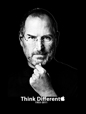
“I like apples and love to eat them. But the main idea behind the apple was to bring simplicity to the people, in the most sophisticated way and that was it, nothing else.”His vision for the next generation computer was so far ahead that it was mind boggling for everyone. No one could think that far into the future, but he did, and hence his most quoted saying is also the most fitting one for his own life. [caption id="" align="alignnone" width="600"]
 Steve Jobs (1955-2011). Photo: Publicity[/caption]
- So, while we worship some of the technological advances gifted to us by Apple, we never really knew how it came to be what it is today. Just the journey transitional journey of the logo shows how Apple has kept evolving- to date. If this journey of bending over backwards to maintain customer satisfaction continues, we will be very happy clients indeed.